| Correspondence Analysis | |||
Page 6 on 8 | Table of contents | Last | Next . |
|||
| 6. Graphical
Representations and Interpretation .. |
|||
. This is probably the most important part of this paper. The reason is that most often when a researcher uses a correspondence analysis the only thing he publishes is the plane created by the first two axes, sometimes by the first three axes of inertia. The table of contribution is sometimes mentioned in the text but scarcely published in its entirety. This way of doing is justifiable by the fact that the graph is the most information rich part of the output, and the main interest of data analysis appears here if at all : the synthetical representation of a big figures table. You should always study the plane created by axis 1 and 2, and sometimes the ones created by axis 1 and 3 or 2 and 3 as well, but rarely more. Here, we will limit ourselves to the first plane. But you should be aware that this is a controversial subject. There are actually several methods to graphically represent the analysis results, and you should be sure to understand their limitations before interpreting them. The 2-dimensional representations (those that live on a sheet of paper) have in common the fact that they all figure either the row-points or the column points and sometimes both in the space created by two axis of inertia (most commonly the first two). The intersection of the two axes, known as the mean centroid, corresponds to the mean profile. Usually the first axis of inertia is drawn horizontally, and at the end of each axis the eigenvalue and the percentage of total inertia explained by this axis is written. The tables just mentioned (COR, CTR, QLY,...) are very useful in interpreting the graphs, although you won't always find them in published papers, and so you should be able to drain all the information out of the 2-dimensional graphs, because that's all you will have if you did not make the analysis yourself. By the way, it's the main interest of this method to allow people to summarize information by a smart change of axes and to give back most of it in the form of a plane graph. . . |
|||
A. |
The Asymmetric Graph |
||
| .. This is, for the purists, the best
representation, and the one least prone to push you to wrong interpretations. The row- and
column-points are figured in two different scales, which makes some widely scattered as
others are narrowly grouped around the origin. In this graph the distances are
interpretable in terms of .. |
|||
B. |
The Symmetric Graph |
||
| . The most common representation in the literature, but the most controversed as well. Here the representations of row- and column-points are drawn one above the other on the same graph, at the same scale. You can immediately recognize this one because the points tend to cover the whole graph, whatever the level of association between them. But beware ! If the distance within row- and
column-points are both an approximation of the . . |
|||
C. |
Interpretation of the Distance within Points of a same Cloud |
||
| .To
interpret the graph, one should only consider the positions relative to an axis of the
points belonging to a same cloud. We will thus only interpret the position of a community
relatively to that of another community, or of a schooling level relative to another
schooling level. Two such points close on the graph will have a similar profile. In other
words, if Crissier and Renens are close (c.f. infra), that means that the inhabitants of
these communities have answered to the schooling level question in similar proportions. .. .. |
|||
D. |
Angular Interpretation between points belonging to Different Cloud |
||
| . It is very uncertain to say the least to interpret the proximity of two points from two different clouds. This is, however, a common error, which makes some authors discourage the utilization of the so called symmetric graph, and even simultaneous representation of two clouds. But you can do something else. You can interpret the angle between a row point and a column point (taking the origin as the summit) following some simple rules : .
|
|||
E. |
Interpretation of the angle between a Point and an Axis, or the Graphical Expression of COR |
||
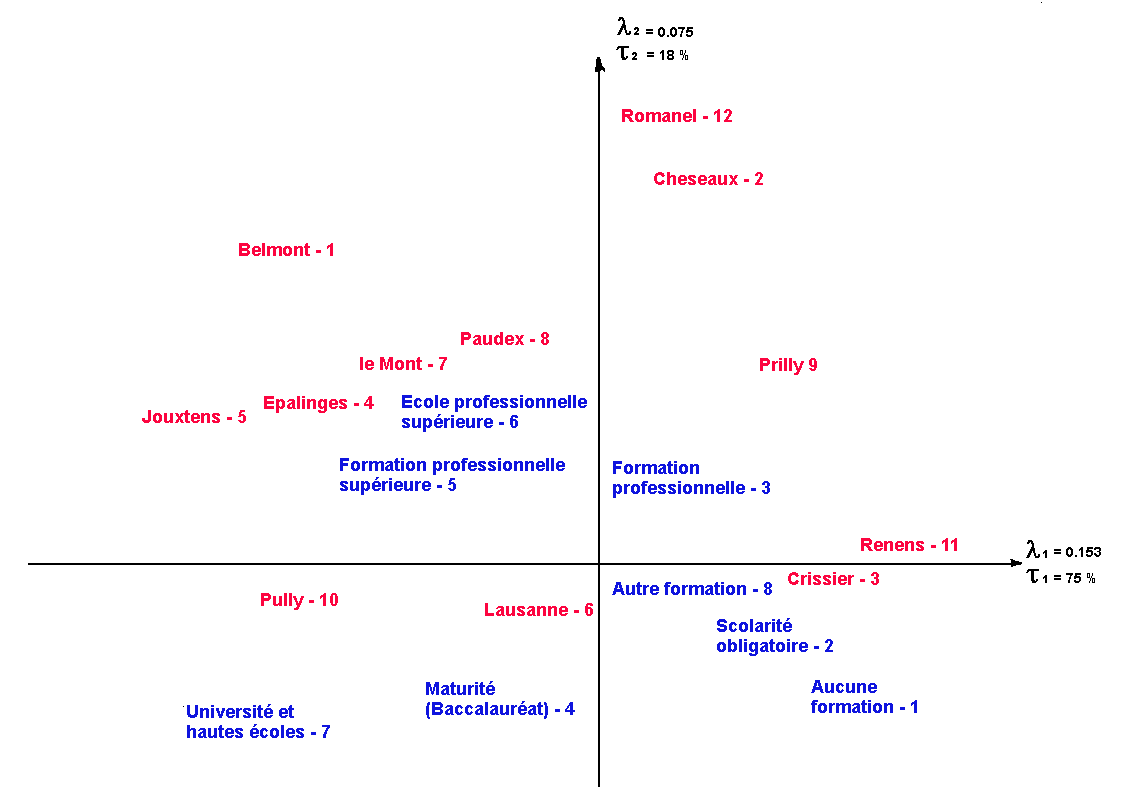
| . Graphically, the smallest the angle between a point and an axis (with the origin as the summit), the closer to 1 will be its COR on this axis. Conversely, if the angle is close to 90º, the COR on this axis will be 0. It is thus the factor (axis) from which a point is the closest that will best explain its distance from the mean profile. For example, Romanel and Cheseaux are both very close to the second axis, and have a COR on this axis that exceeds 90%, which means that this axis explains more than 90% of their inertia. . . |
|||
F. |
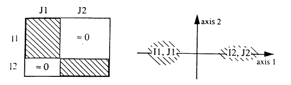
Two typical Patterns |
||
| . The layout of the points on the graph reflects the structure of the table. Some characteristic shapes are easily interpretable in terms of the repartition of the population in the table. We will look at the two most common here, suggesting the reader to look at (Benzecri, 1993:400sq) for more details. In what follows, we will assume that the table can be exhaustively divided in I = I1 U I2 et J = J1 U J2. In the first typical pattern, the cloud is broken in two clusters : .
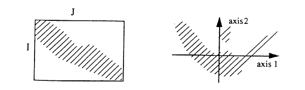
. We that, on the one hand the values of the I1 group are associated with those of the J1 group, and on the other hand, that the values of the I2 group are associated with those of the J2 . group. If we group the values of both variables according to their projection on the first axis, we get a new table (totally equivalent to the original contingency table, but differently laid out), whose diagonal blocks I1XJ1 and I2XJ2. are very full, and with the I1XJ2 and I2XJ1 blocks rather empty. This structure of the table reflects a dichotomy in the data, which naturally divides itself in two clusters. In such a table, you have to ask which is the underlying logic that makes the clusters in the data. . In the second typical pattern, the cloud makes a parabolic crescent : .
. If we were to write the table again, ordering the values (rows and columns) in the order of their projection on the first axis, we would get the table above left, whose diagonal is filled with relatively heavy cells (fi*fj<<fij). The small points group at the top of the second axis reflects a flat profile to which contributes the two ends of the crescent, the conjunctio oppositorum if you want. . . |
|||
G. |
Interpretation of the first Axis |
||
| . On the graph I made from our table, we see that the first axis is clearly interpretable as a spatial social segregation axis. It opposes on the right the working class neighborhoods of Renens, Crissier and Prilly to the upper class neighborhoods of Jouxtens, Belmont and Pully on the left. Other places like Lausanne or Romanel are very badly represented on the first axis (according to the relative contributions), which you can tell by their central position. On the other hand, this axis opposes the quality schooling Universite-Hautes ecoles to the more simple one like Scolarite obligatoire and Aucune formation in a transitive gradation. The central position of values like Autre formation and Formation professionnelle shows a very bad representation on this axis, and it would thus be misleading to interpret them. .. . |
|||
H. |
Interpretation of the second Axis |
||
| . The second axis, less easy to interpret, seems to oppose Romanel to Cheseaux and Lausanne . . The angle between Romanel and this axis is very small, which indicates a high COR. (Renens, Crissier and Pully, are very badly figured on this axis, which you can tell from their central position). The points formation professionnelle, formation professionnelle superieure and ecole professionnelle superieure are clearly detached on the two superior quadrants. The other points should not be taken in consideration when interpreting this axis, because of their low COR on this axis. The row point Formation professionnelle makes 42% of the axis, and if we look at the profile table, we realize that in Romanel as in Cheseaux about 50% of the population has declared Formation professionnelle, against 37 % in the total population. We also see that Renens and Crissier have a mean position on this axis (they are close to the origin), because they have about 37% of Formation professionnelle. Pully and Lausanne lower on this axis, have less than their share of Formation professionnelle. With no supplementary hint, I would not have been able to interpret this axis. I asked the wise professor Racine, who of course already had run a similar study with much more variables. He found the same second axis everywhere in Switzerland, and he was eventually able to give it some meaning. For him, this axis separates the middle class. If we look at the projections of the points on this axis, we see that in its positive part (above) the very qualified professional schooling (Ecole professionnelle, Formation professionnelle. and Formation professionnelle superieures) opposed in the negative part to Autre formation, Scolarite obligatoire and Aucune formation (we abstract the already talked about points on the first axis). We then see on our graph three clusters of schooling levels, showing three levels in the social structure. In the lower right quadrant, the working class, in the upper right quadrant, the lower middle class, in the upper left quadrant, the upper middle class (important and rich in Switzerland), and last but not least, in the lower left quadrant, the upper class and the intellectuals. The communities with the most affinities with those fractions are figured on the graph in their direction. . |
|||