| Correspondence Analysis | |||||||||||||||
Page 5 on 8 | Table of contents | Last | Next . |
|||||||||||||||
| 5. What you find in the output and how to interpret it. | |||||||||||||||
. The first software for correspondence analysis have been developed in France, but now the international scientific community has produced some too. This explains that contrary to what is common in statistics, you may encounter french terms. I have tried to use the most common words, but the best is to first understand what use are the different statistics and then look for them in the output, whatever their name in the particular software you use. . |
|||||||||||||||
A. |
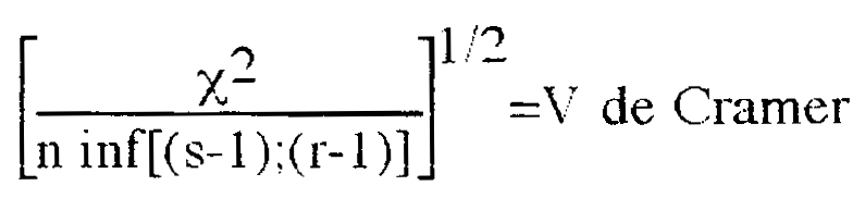
Absolute distance, relative distance |
||||||||||||||
. First you have to remember that correspondence analysis
gives you a synthetic picture of the structure of the distance to independence. We first
consider the value of the Some people proposed coefficient that varied from 0 to 1 to
give an idea of the value of the :
This statistic has been computed for our table and is worth 0.065 The novice reader can switch the next part in a first reading and read the part on graphical representations first. . . |
|||||||||||||||
B. |
Eigenvalues and the table's inertia |
||||||||||||||
. In the first part of the listing, after the three table given above, SPSS did extract the 7 factorial axis of our table and print the following table : .
. The 7 factorial axis are given in descending order, and for
each one the eigenvalues and the singular values. Then comes the sum of the eigenvalues,
equal to the cloud's total inertia or One can interpret these values as follows : proportion explained =0.753 means that the first axis of inertia can summarize 75 % of the distance to independence (that is, inertia) of our table, and cumulative proportion = 0.934 means that the first 2 axis summarize 93 % of the cloud's inertia. . . |
|||||||||||||||
C. |
How many axis to
keep ? |
||||||||||||||
| Miracle of factor analysis, with a sacrifice of 5
dimensions on 7 we loose only 7 % of the total inertia ! And that is a general fact : the
contribution of eigenvalues to the explication diminish in every analysis that I read, and
usually the researchers keep only the first 2 or 3 axis of inertia. Some people give
complex mathematical criterion to determine the number of axis to keep, but in my opinion
(I share that one with Benzecri : c.f. Benzecri, 1992:398) this limit should be fixed by
our capacity to give a meaningful interpretation to the axis we keep. You give the
computer the number of axis that you want to keep after having first checked the
eigenvalues and the general meaning of the axis. It's not because an axis has a relatively
small eigenvalues that you should discard it. It can often help you make a fine point
about the data. In our example, we will only keep the first two axes. We then ask the computer to run the analysis again with only the first 2 dimensions, ant all the following results will contain no more that the first 2 axes. . . |
|||||||||||||||
D. |
Factor scores |
||||||||||||||
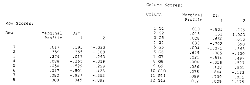
| . The following two tables give us the coordinates of each point on the axes we kept, as well as their weight. Here is the table row et column scores as printed by SPSS for our example table.
We see that everything is in percentage and that some are negative. A column gives us the mean profile. For example, we'll interpret line 6 of the column scores printout as follows : in Lausanne, we find 0.649 of the table's population, and the Lausanne point will be represented in the first two axis space with the coordinates (or factor scores) (0.005;-0.130).We could have had as much as 7 columns, one for each axis. These columns are sometimes known as DIM, F or K. .
. . |
|||||||||||||||
E. |
Absolute contributions by point |
||||||||||||||
| . We then would like to know which point have contributed the most to the building of each axis. Two tables printed by SPSS, contribution of row/column points to the inertia of each dimension, give us these informations. .
. These values are often found in the literature as CTR or absolute contributions. Why absolute ? In one of the first software, this table gave under the "CTA" heading the value of the inertia caused by a point that was in the direction of a given axis. Absolute contribution came from that. Later, and now, the part of the inertia given by a particular axis accounted by a particular point is given, in percentage. The old name stuck. We see for example that line 7 (University) is responsible
of 46% of the inertia explained by the first axis. As the eigenvalue associated with the
first axis is Theses values are important to interpret the axes. Graphically, the further a point is from the origin, the smaller its marginal weight is, the bigger its contribution to inertia. In a first analysis, I had included a "no answer" line that had a very grotesque profile in the commune space. I had to delete it because it distorted the cloud so much that it obscured everything else. . . |
|||||||||||||||
F. |
Absolute contribution by cell |
||||||||||||||
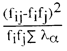
| . One could want to know the contribution of each cell to total inertia. The cells with the most improbable values (in the sense of the independence hypothesis) will then give the biggest contributions. SPSS does not give this table (that is a defect) but you can compute it yourself with the following formula : .
Ï used Excel to compute each cell's contribution : .
We see for example that the intersection (University, Pully) is responsible for almost 15% of the table's total inertia. Not surprising that this cell draws the first axis so much ! We see other points like (Jouxtens, Formation professionnelle) with very small values, explained by the little absolute distances, as seen in the table above. . . |
|||||||||||||||
G. |
Contributions relatives par points et par axes |
||||||||||||||
| . Finally, we can ask the opposite question, that is, which part of the inertia of each point is given by my axes ? The following table, with the strange label contribution of dimensions to the inertia of each row/column points, often named COR and QLY (for quality) or relative contributions answers that question : .
. We see for example that the inertia of Pully (column 10) is "given" at 96% by the first axis and at 1% by the second. Together, the surface of the axes 1 and 2 gives 97.5% of the inertia of this point (under total). This last column is often named QLY for the quality of the representation by the subspace created by the k first axes. We can draw a parallel with the principal component analysis : eigen values and eigen vectors have the same status, and we can interpret the squared saturations like our COR, and the communality given the r factors we kept as the QLY. of he representation for the first k factors. These indications are important to interpret the graph, but the if the researcher outlines the most important aspects of these side printout, he can happily omit them in his published paper and just keep the commented graph. . |
|||||||||||||||