| Correspondence Analysis | |||||
Page 3 on 8 | Table of contents | Last | Next . |
|||||
| 3. The Analysis I |
|||||
A. |
The Independence Hypothesis |
||||
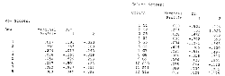
| . In order to be able to say something meaningful about our table, we need something to compare the observed distribution of the individuals in its cells to. The simplest is to ask what would be the cell content if the individuals were distributed equally among the communities, their absolute number depending only on the overall size of the community's population. We know for example that our whole population contains 8.2% of University level people (c.f. the profile table below) and that Pully accounts for 7.8% of the total Lausanne district population. We should thus have, under the independency (or homogeneity) hypothesis 0.082x0.078x169836 people in the (University, Pully) cell, which is 1086. The next table gives for each cell the value it would have under total independency of rows and columns, that is, between level of schooling and community of residence. .
. But to be able to judge the affinities a little better, we could subtract this matrix from the first (the original data table). We thus get a table giving the absolute differences, which I calculated with sweat and tears on Excel. .
. We read in the (Uni, Renens) cell the value -799. That means that we should observe 799 university-level people more in Renens if the independence hypothesis was satisfied. There's thus so to speak a deficit of university-level people in Renens, or an under-representation. We observe the opposite in the neighboring community of Jouxtens, with a surplus of 56 people. But for Jouxtens's small overall population that is much, The goal of correspondence analysis will be to summarize these over and under-representations not in absolute values as we just did, but in relative values. More generally, independence is the situation we would
observe if the number of individuals in the cell (i,j) was the the product of the sum of
row i by the sum of column j divided by the grand total of the table. This is the
theoretical number of individuals of the . . |
|||||
B. |
Khi2 and
inertia |
||||
| Our original data is in the form of a table in which
individuals are assigned to a cell according to two criteria, I and J. We are thus allowed
to use the Is this We must remember from this discussion that the greater the inertia, the greater the association between row and column (the distance from the mean). Inertia can be as low as 0 (no association) and as high as the rank of the matrix (card(I)-1, perfect association of each line with each column. The absolute value of the inertia will depend on units used for the variables, if the analysis is not made on a true contingency table, i.e. if the table does not contain a number of individuals but rather $ or Cm. . . |
|||||
C. |
Profiles |
||||
| . The points on which correspondence analysis will work are defined by a column vector, that is, they are profiles, or percentage relative to the sum of the line or column. Our table can be broken in line profiles : .
. where we find in lines the 12 columns of each points (schooling level) or, equivalently, the table of column profiles : .
. which gives us the 8 coordinates of the 12 community-points in the schooling level space. I omitted the labels on these tables and the following, but the order remains the same (SPSS is so capricious !) What you find under margin in the tables above is also known as mass or mean row and column profile, or even center of gravity, that is the number of individuals in the whole line (or column) corresponding to the point divided by the table total, and this for each point. These profiles are the coordinates of a cloud of point N(I) in the J space or, equivalently, a N(J) cloud in the I space. We are first going to present the analysis of the N(I) cloud, and then we'll show the total symmetry of the N(J) cloud analysis. . . |
|||||